Brand Guidelines
The TAMS visual identity — open, and free for everyone to use.
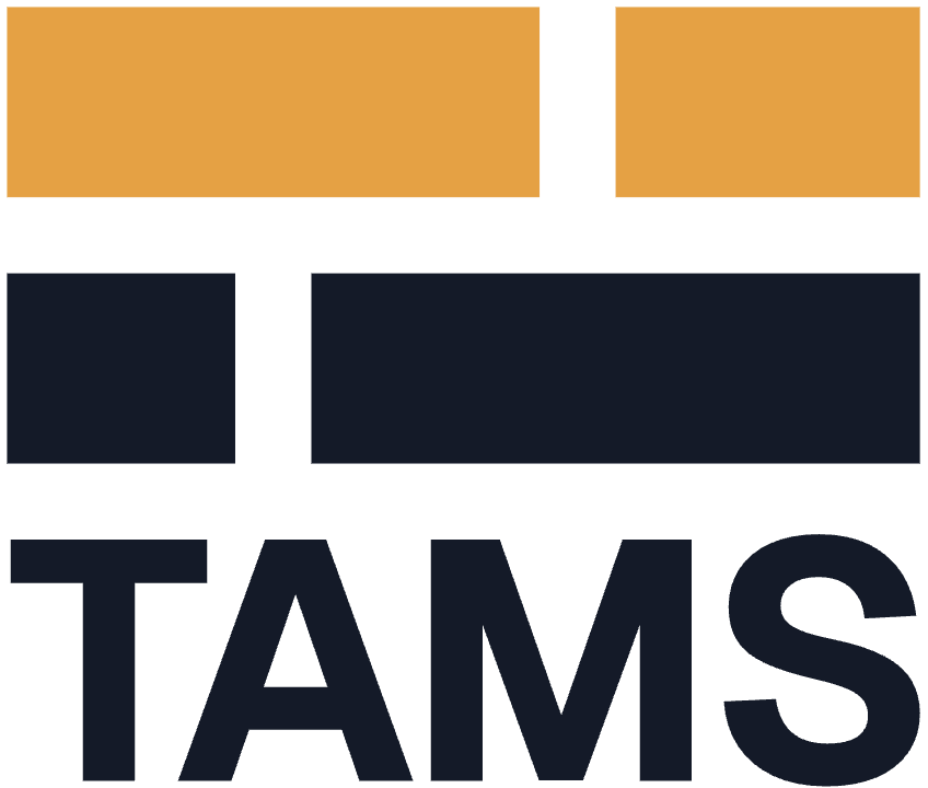
The TAMS visual identity is built from the specification itself. The mark is four media segments across two timeline tracks, staggered so the negative space reads as a T. There are no curves, no gradients and no illustration — just simple shapes on a grid, which means it stays legible stamped at 16 pixels, printed in a single ink, or stitched into fabric.
The mark
The mark is drawn on a fixed 24 × 12 unit grid: two 5-unit tracks separated by a 2-unit gutter. The top track carries Playhead Amber; the bottom track carries the foreground colour — white on dark backgrounds, navy on light.



- Clearspace — keep clear space of at least one track height on all sides.
- Minimum sizes — avatar at 48 / 32 / 24 px, favicon at 16 px. Below 24 px, use the mark inside its rounded navy tile, not the bare mark.
- Single colour — where the duotone won’t work, use the single-colour mark in Signal White (on dark) or Control Navy (on light) only. Don’t recolour it in any other colour.
Lockup
The lockup pairs the mark with the Geist Bold wordmark — set side by side (horizontal) or above (stacked). Use the horizontal lockup by default; the stacked lockup suits square or narrow spaces. Like the mark, it comes in duotone and in single-colour white or navy.




Colour
A broadcast-gallery navy with a single amber accent — the playhead. Amber is reserved for emphasis (the top track, cursors, links, highlights); never use it for body text or large fills.
#141A28Primary background · ink on light.#FFFFFFText on dark · UI surfaces.#F5F4F0Light backgrounds · documents.#E5A144Accent only · top track · links.Typography
Geist for the wordmark, headlines, UI and body copy. IBM Plex Mono for anything machine-adjacent — endpoints, IDs, labels and timeranges. Both typefaces are under the SIL Open Font License.
Aa Bb Cc Dd Ee — 0 1 2 3 4 5 6 7 8 9
?timerange=[0:0_10:0)
Download
Everything is open — no request form, no licence fee. The logo kit ships as SVG (outlined type, no fonts required) and transparent PNG. If you need a format that isn’t in the kit, open an issue on the TAMS repository and it’ll be added for everyone.