TAMS — the Time-addressable Media Store — is an open specification for storing and reading media by time rather than by file. Until now, the ‘logo’ has been something we cobbled together to put on slides and stickers. That changes today.
The new TAMS identity is built from the specification itself. The mark is four media segments across two timeline tracks, staggered so the negative space reads as a T. There are no curves, no gradients and no illustration — just simple shapes on a grid, which means it stays legible stamped at 16 pixels, printed in a single ink, or stitched into fabric.

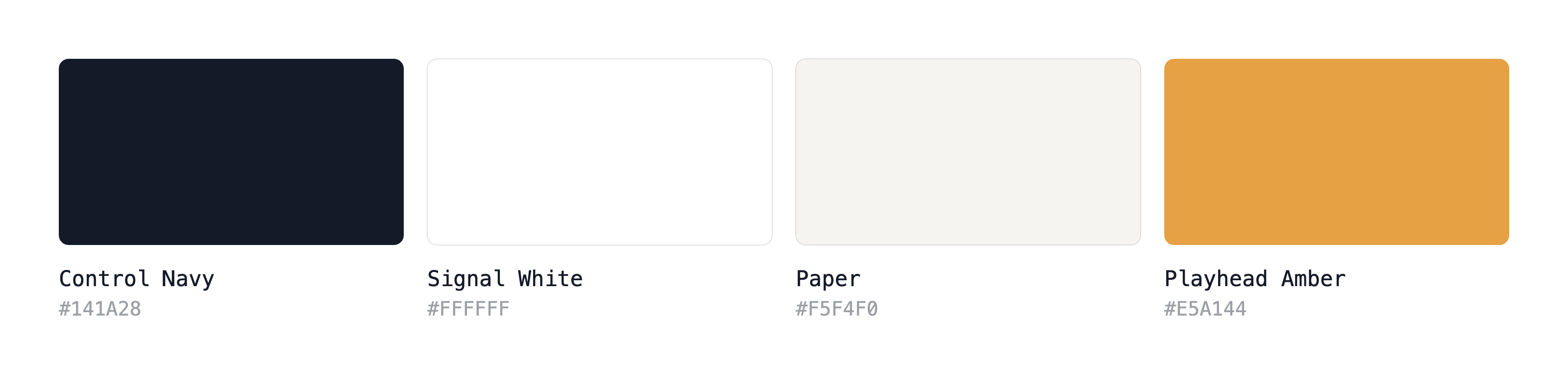
The palette is a broadcast-gallery navy with one amber accent, rationed so it always signals emphasis. Typography is Geist for headings and body, IBM Plex Mono for anything machine-adjacent: endpoints, IDs, timeranges. Both typefaces are under the SIL Open Font License.
Everything is open. The logo kit ships as SVG with outlined type, no fonts required. Alongside, there are transparent PNGs, in horizontal, stacked and mark-only lockups, duotone and single-colour. There’s a brand guidelines document covering usage, and a drop-in GitHub Pages theme that the TAMS website uses.
No request form, no licence fee. If you need a format that isn’t in the kit, open an issue and it’ll be added for everyone.
Guidelines and assets: TAMS Brand Guidelines.